
Danny DeSousa
Data Analyst | BI Analyst
About Me
Hi I’m Danny DeSousa, a former collegiate athlete turned analyst with a passion for solving problems and uncovering insights through data. My journey from the field to the world of analytics reflects my drive to keep learning, adapting, and making an impact through meaningful work. This portfolio displays the projects I've built so far using SQL, Excel, and Tableau to drive business insights and recommendations. Thanks for checking it out!
Skills

Core Tools
SQL · Python · Tableau · Excel · SASAnalytics & Modeling
Data Cleaning · Visualization · Predictive Modeling · KPI Design · Statistical AnalysisProfessional Strengths
Data Storytelling · Pattern Recognition · Process Optimization · Collaboration
Featured Projects
SQL | TABLEAU SPORTS BETTING PERFORMANCE dashboard
Analysis of sports betting trends from the bookmaker’s perspective.


TABLEAU | Excel | SAS imdb movie exploratory data Analysis
Exploration of movie performance trends using IMDb data from 1990 to 2024.
SQL US HOUSEHOLD INCOME DATA Analysis
SQL data cleaning and exploratory analysis of 2022 U.S. Census income data.


EXCEL | TABLEAU stock performance analysis
Comparative analysis dashboard for Nike, Adidas, and Under Armour stocks.
Work Samples
Additional work that supports my analytics experience — including Excel dashboards and project presentations.
View Workbooks
excel mini projects
US Debt Tracker Analysis
VLOOKUP & Pivot Tables
Presentation Decks
IMDb Movie Performance Analysis
Stock Performance Analysis
View Presentations
Professional Certifications
My growing list of proprietary certifications.

Google Data Analytics Certified | Issued Feb 2025
Python Programming for Beginners - Analyst Builder |
Issued Oct 2025


Tableau Essential Trained | Issued Mar 2025
SQL | TABLEAU SPORTS BETTING PERFORMANCE dashboard
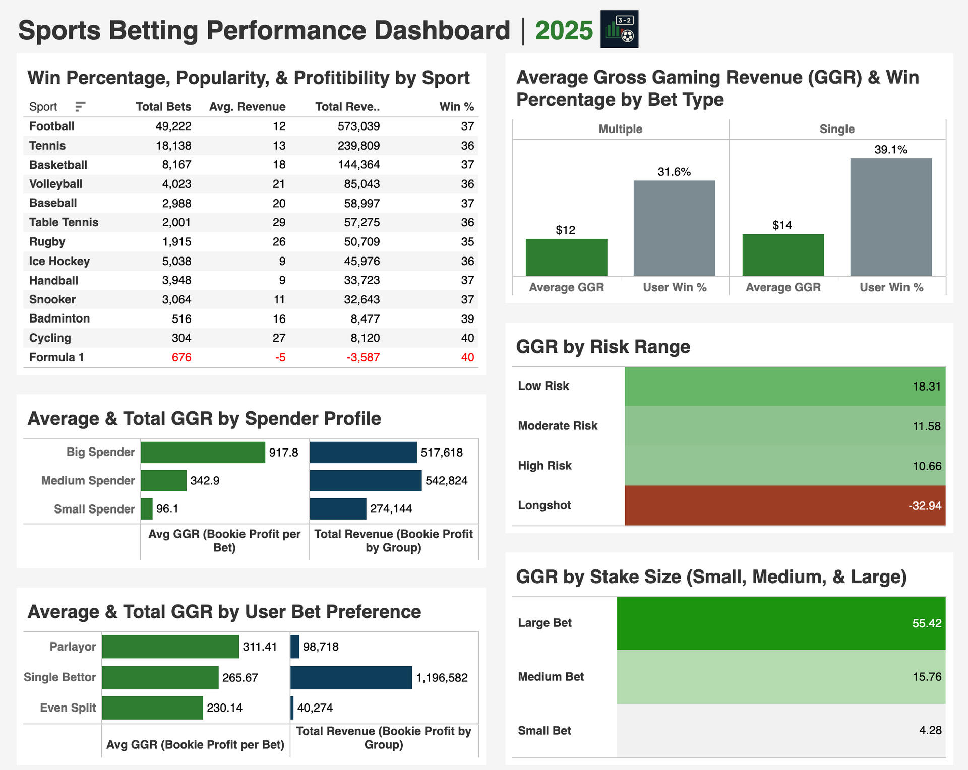
This project explores sports betting trends from the bookmaker’s perspective, focusing on how bettor behavior, risk levels, and bet types affect profitability. Built with SQL and Tableau, each chart is driven by custom MySQL queries using data from a Kaggle sports betting dataset with 100k rows.In this project, I set out to explore the following questions:
1. Which user profile—based on stake size and preferred bet type—generates the highest average gross gaming revenue (GGR)?
2. Which sport is both the most popular and has the highest win rate?
3. Are single or multiple bets more successful overall?
4. Do bookmakers earn more from low-odds or high-odds bets?
5. Is there a correlation between stake size and profit or loss?These were the steps I took to conduct the analysis:
1. Pulled the dataset from Kaggle, created a schema in MySQL, and performed data cleaning and preparation for analysis.
2. Briefly explored insights including sport popularity, user betting activity, and stake size distributions.
3. Wrote MySQL queries using CTEs, joins, subqueries, window functions, and aggregate functions to pull the key insights.
View SQL Script on my GitHub
4. Connected MySQL to Tableau and imported query results for visualization.
5. Designed visualizations in Tableau and organized them within a structured dashboard.
6. Formatted the dashboard layout and highlighted KPIs for clarity.Here are my key takeaways:
1. The house tends to profit more consistently from low-risk bets and larger stake sizes.
2. Both Longshot wagers and Formula 1 bets result in losses for the bookmaker.
3. While single bets have a higher win rate than multiple bets, they still generate more profit for the house on average.
4. Bettors stake similar amounts regardless of risk level, with average stakes ranging narrowly from $125 to $133.What does this mean for the Bookmaker?
These trends show that the house does best with low-risk bettors, who are more consistent and profitable. Getting these users to place bigger bets could help increase profits even more. While Longshots and Formula 1 bets lose money overall, they might still be useful for keeping bettors engaged with some limits to avoid too much risk. Since players tend to bet similar amounts no matter the risk, there is a chance they do not realize how much worse the odds are for Longshots. That is something the house could take advantage of through how the platform presents odds or structures bets.
TABLEAU | Excel | SAS imdb movie performance Analysis
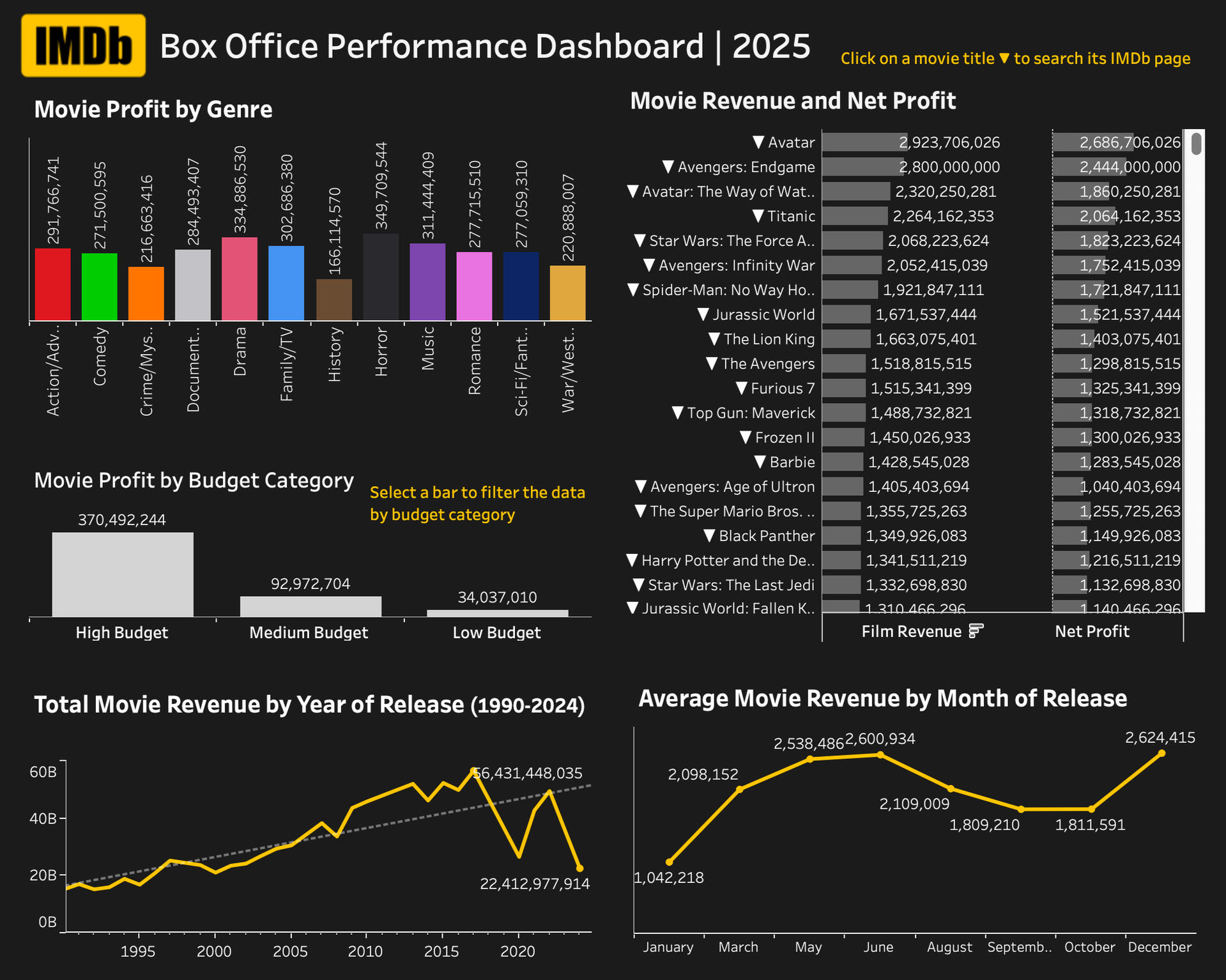
This interactive Tableau dashboard was created as a capstone project for my Advanced Data Analytics course. It explores a Kaggle IMDb Movie dataset to reveal trends in financial performance, focusing on key metrics such as profit, revenue, budget, and viewer ratings.View the full interactive dashboard on my Tableau Public ProfileIn this project, I set out to explore the following questions:
1. Which movie genres have historically generated the highest profits?
2. Which months see the strongest box office performance?
3. How has the film industry’s financial performance trended year over year?
4. Which films achieved the highest box office revenue and net profit?
5. What is the relationship between a film’s budget and its profitability?These were the steps I took to conduct the analysis:
1. Retrieved the dataset from Kaggle and used Excel and SAS Viya to clean and prepare the data for analysis.
2. Imported the cleaned dataset into Tableau to develop visualizations.
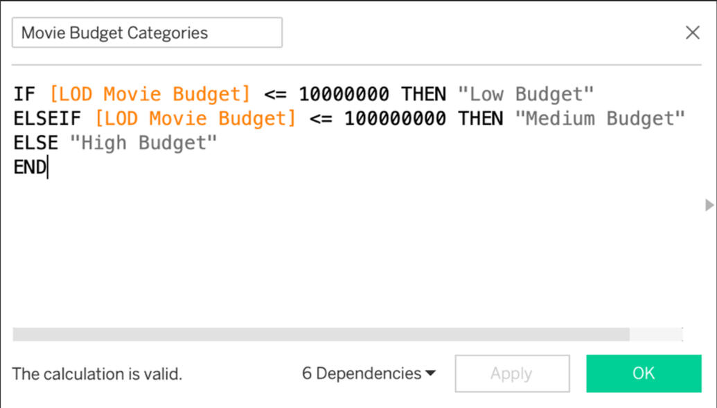
3. Created two calculated fields during pre-processing: Movie Budget Categories and Genre Groups.
The Movie Budget Categories field grouped films into bins based on production budget, making it easier to compare performance across tiers.
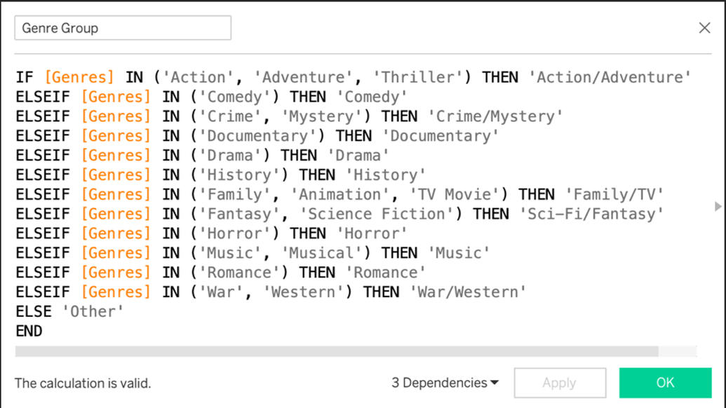
The Genre Groups field consolidated thousands of unique genres into broader, more interpretable categories, improving accuracy and overall clarity.
4. Designed visualizations and organized them into a clean, interactive dashboard.
5. Added filter actions and tooltips that allow users to explore data by film budget category and directly access the IMDb page of each selected movie.
6. Explored the predictive relationship between key variables and movie profitability using SAS Viya.
7. Conducted a correlation analysis to identify significant trends and variable associations.
*While full predictive modeling wasn’t feasible due to variable constraints, correlation analysis offered valuable insight into the strongest relationships in the data.
8. Summarized key findings and the full analysis process in a final slide deck presentation, viewable here.Here are my key takeaways:
1. Films with larger budgets generally resulted in greater net profits, though returns were more variable at the high end.
2. Movies released during summer (June–August) and late fall (November–December) tended to perform better at the box office, aligning with summer and winter holidays (peak audience interest periods).
3. Revenue trends from 1990 to 2024 show a general upward trajectory, with some dips during significant global events.
4. Certain genres like Horror consistently performed better in terms of average profit, while History films generally performed the lowest.What does this mean for the film makers and studios?
Bigger budgets often lead to higher profits, but they also bring more risk—so spending wisely matters. Timing plays a big role too, with summer and holiday releases typically performing better. Studios should focus larger investments on projects with broad appeal, like franchise films in high-performing genres. A balanced mix of both high and low budget films may offer a more reliable and sustainable financial strategy for filmmakers.
SQL US HOUSEHOLD INCOME DATA Analysis
The objective of this project was to leverage a U.S. Census dataset with over 32k rows to analyze household income patterns, geographic size, and city-level income rankings with the goal of identifying economic trends relevant to real estate strategy. This project highlighted high-performing regions, both nationally and within my home state of Georgia, to demonstrate how data-driven insights can support smarter market targeting.This MySQL script along with other project scripts are available here on my GitHub.In this project, I set out to explore the following questions:
1. Which US States have the highest and lowest average household Income?
2. Which US States have the most Land Mass and Water mass?
3. Which US Cities have the highest and lowest average household income, and how does that compare to the National Average?
4. What does the average household income look like in the cities of my home state, Georgia?These were the steps I took to conduct the analysis:
1. Created a new schema and imported the dataset into MySQL for data cleaning and preparation.
2. Renamed tables and standardized column values for better readability and consistency.
3. Checked for missing values and duplicates, which removed 253 rows with missing data. Then I filtered out repeated entries using the ROW NUMBER window function.
4. Corrected data entry errors in columns like State Name, Type, and Place to improve data accuracy.
5. Joined the two tables on the id field to combine geographic and statistical information.
6. Conducted exploratory data analysis using SQL queries to uncover income trends by state, city, and region.
7. Calculated average household income by state and ranked them to identify national leaders.
8. Analyzed land and water area by state to provide geographic context useful for real estate or infrastructure planning.
9. Compared city-level incomes to the national average, highlighting areas with significantly higher or lower income levels.
10. Focused on income insights in Georgia, my home state, to explore local patterns and real estate potential.Here are my key takeaways:
1. The national average household income was $67,356, serving as a baseline for comparing income levels across cities and states. District of Columbia (D.C.), Connecticut, and New Jersey stood out as the most affluent places with average incomes more than $20,000 above the national average.
2. Delta Junction, Alaska recorded the highest average household income at $242,857, while Center, Colorado had the lowest at $10,946, demonstrating the wide income gap across U.S. cities.
3. The five largest states by land area were Alaska, Texas, Oregon, California, and Montana. The top five by water area were Alaska, Michigan, Texas, Florida, and Hawaii.
4. In Georgia, Milton, Johns Creek, and Alpharetta ranked as the top cities by average household income, pointing to concentrated areas of affluence within the state.
EXCEL | TABLEAU stock Perfromance analysis: Adidas, Nike, Under armour
This project was created for my Business Analytics course as an exercise in building data visualizations with Excel and Tableau. I chose to compare the stock performance of three major athletic apparel companies: Adidas (ADDYY), Nike (NKE), and Under Armour (UAA). As of June 3, 2025, I updated the Tableau dashboard to make it more interactive and highlight key trends more clearly. The local version includes the live market window for added context, while the Tableau Public version includes only a screenshot placeholder due to the platforms URL limitations.In this project, I set out to explore the following questions:
1. How have Adidas, Nike, and Under Armour stock prices trended from 2019 to early 2024?
2. Which company has shown the most consistent growth or volatility?
3. Are there noticeable patterns in share volume that align with price changes?
4. What external events may have influenced spikes or dips in stock performance?These were the steps I took to conduct the analysis:
1. Collected historical stock data (daily closing prices and share volumes) from Yahoo Finance for all three companies from April 2019 to February 2024.
2. Cleaned and structured the data in Excel to ensure accuracy and proper formatting for use in Tableau.
3. Created an interactive dashboard in Tableau that includes:
- Time series line graphs comparing closing prices.
- Volume analysis to spot trading activity spikes.
- Year filter to allow users to narrow analysis by specific periods.
- Dynamic buttons that adjust the embedded Google Finance window to display live stock trends per company (only functional in local version).
4. Edited the public version of the dashboard for presentation, replacing live content with screenshots due to Tableau Public limitations.Here are my key takeaways:
1. Since 2021, Nike, Under Armour, and Adidas stock prices have followed very similar trends, moving almost in sync.
2. From 2019 to 2024, Nike’s stock rose by about $18, while Adidas and Under Armour saw overall declines in their average closing prices.
3. Adidas had a major spike in trade volume in 2022, reaching about 43 million, compared to 14–17 million in other years.
4. These patterns suggest that Nike performed more steadily, while Adidas and Under Armour were more affected by market shifts or major events.